

Some Art in San Francisco Part 6
On recent work by Lisa Jo, Hayal Pozanti, David Antonio Cruz, Misako Miki, and Amanda Ba

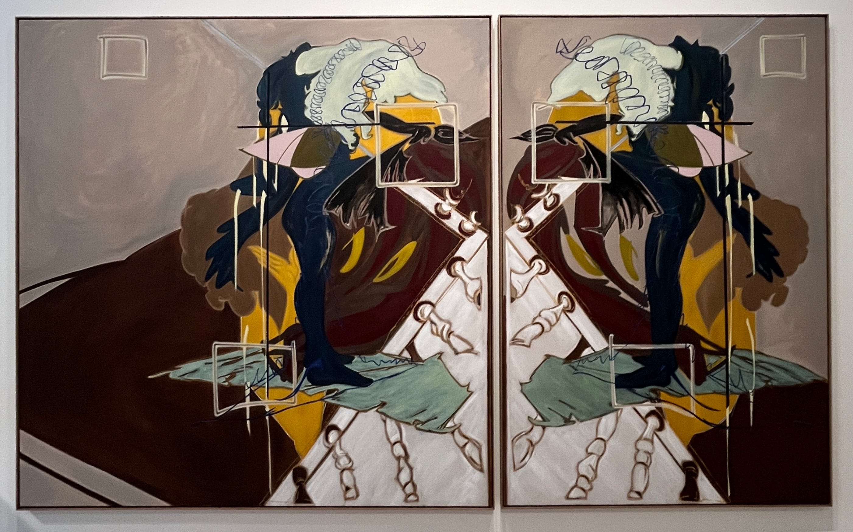
Lisa Jo at Wendi Norris
I recall seeing an exhibition of Cheyney Thompson’s paintings at Andrew Kreps in 2009 and thinking the work, with its arch intellectual proclivities, was being made with a very specific audience in mind. It was “para-theoretical” painting, the kind of work that was calling to the editorial boards of certain favored academic journals or Tim-Griffin-era Artforum for inclusion in their pages. And, I confess, I thought it was great. It was a visual puzzle: it gestured at all the paradigms it was working through, all the problems it was staging for itself; it was an academic argument rendered visual and just poetic enough to cover its tracks.
So, yes, I liked it, but there was also an uneasy feeling about it being so self-conscious, so self-aware and obvious about its targets, and so much in the vein of a knowing, MFA-program era, one admittedly mixed with a Seth-Price-Reena-Spaulings-new-millennium-NYC-downtown cool that felt at once expansive and urgent but also claustrophobic (motto: “all the taste that can fit under a trucker hat”). It was a highly-educated insider’s art championed by agoraphobes.
There is a hint of all this in Lisa Jo’s paintings, but that’s probably on me. It’s not what Jo’s works are about. Her paintings are easily some of the smartest, most heady, most rigorous paintings that I have seen of late. There is a constant, almost relentless, push and pull between design (forms that have been thought out, planned, composed) and gesture (actions, marks, traces). But there are other tensions at work as well. All of the conditions with which painting today must contend — its status as image and decoration, its claims for autonomy, both on the part of the work and on the part of the worker, its imbrication within a deep but contingent and contested (art) history, its utter ubiquity as the default medium of “Art” in the social imagination — can be raised but then just as quickly shoved under the surface of what are otherwise highly appealing but hardly solicitous pictures.
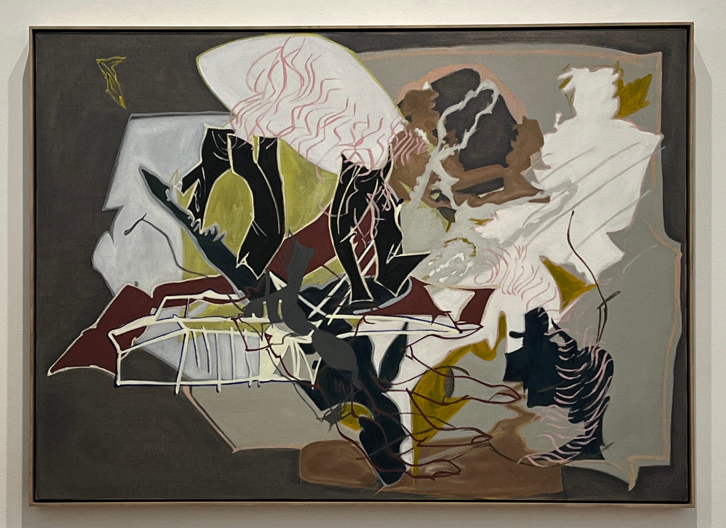
As with any such paintings there will be strange echoes: the ones I hear are Roberto Matta (in the quality of certain lines and compositions), Thomas Scheibitz (for design and the challenge to it) and Neo Rauch (for palette and atmosphere). People attuned to other tones will hear something else no doubt. Jo worked for Charlene von Heyl, and claims to hear her often. I don’t. She is too obviously the offshoot of some Sigmar Polke and Gerhard Richter supergroup. That’s not a tour I see Jo having any part in.
A hesitancy: one gets the sense of Jo’s paintings that they issue so much — too much? — from her mind, which is not to think of them as merely intellectual (as Thompson’s works were and could be). They manifest affect (sensation, intensities, not yet fully codified “emotions”) in painting, but painting as a mode of thinking, not just embodiment, what the philosopher Martha Nussbaum once called an “upheaval of thought.”1 The paintings appear to hesitate before that upheaval. Perhaps that’s good, or necessary, because of what could be on the other side.2 Still, I want to see what’s over there; and I want to see it from Jo.
Hayal Pozanti at Jessica Silverman
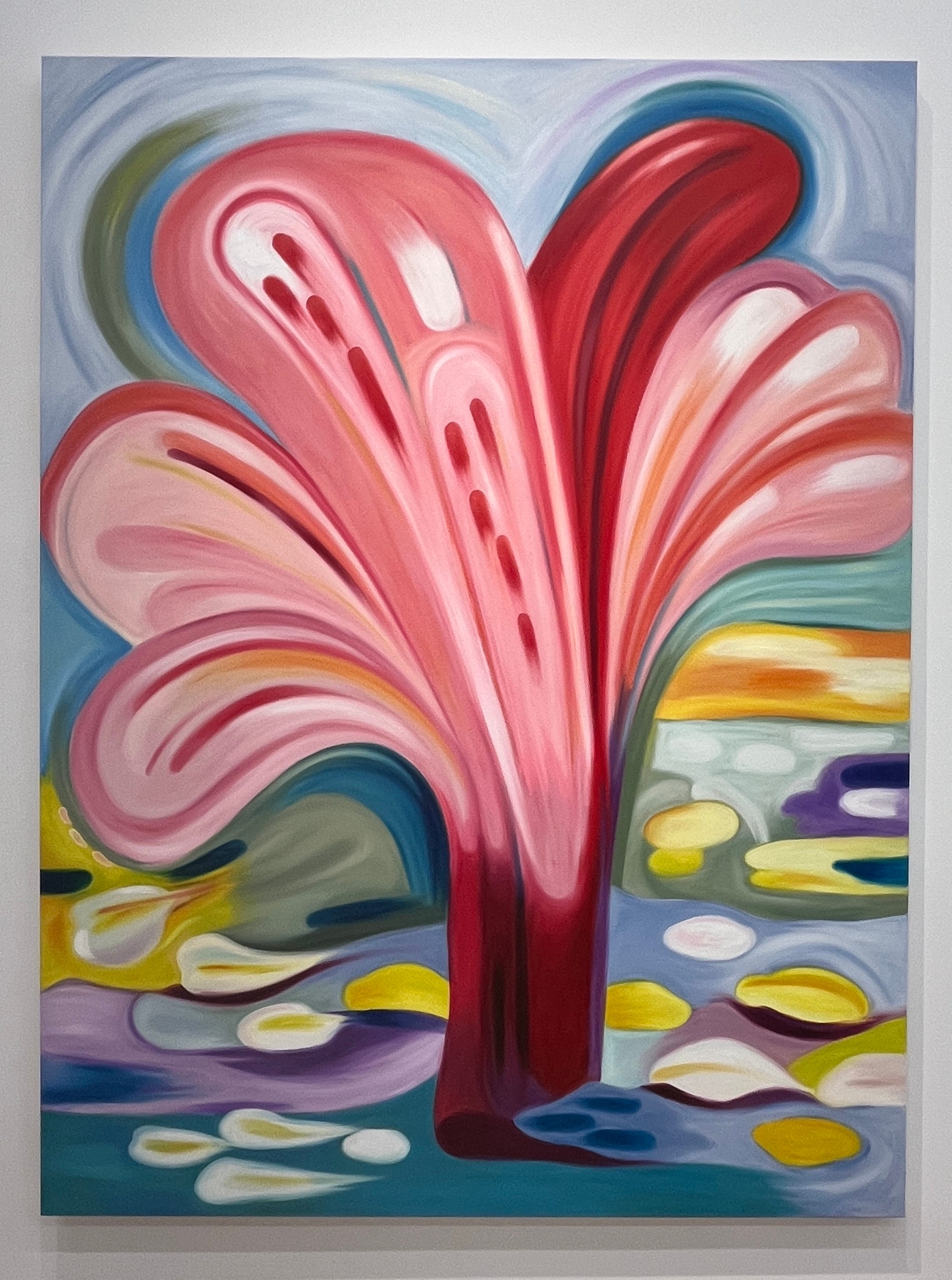
Pozanti and Jo are exact contemporaries and were educated within the same New York milieu (Jo at NYU for a BFA in 2005, Pozanti at Yale for an MFA in 2011). Both began gaining traction in the 2010s. And Pozanti exhibits, or has exhibited, some of the same intellectual tendencies, notably working with her own “alphabet” of forms out of which she would compose her pictures, an attempt to find dry ground amongst the deluge of images offered by the internet and with which all painting must contend.
Those contentions are gone, as is the alphabet, and what’s left is Pozanti’s “style,” now applied to landscapes and still lives with lavish attention paid to big sweeps of color that describe their objects only loosely, allowing petals to register as tongues, clouds as french curves, and so on.
Forgive me the following: but these paintings look something like what one might get by feeding Henri Matisse, Georgia O’Keefe and Hans Arp into a diffusion model and then sexing up the results with the image-processing equivalent of auto-tune. Maybe that’s good? It’s certainly contemporary. No rough edges here (nearly no edges at all). Every shape is subject to a smooth transition, which makes all of the compositions appear “soft,” and so easy on the eyes, and thus the mind. If you need the counterpoint, Wayne Thiebaud would be it. Everything in Thiebaud’s art is in the edges.
One could imagine color providing Pozanti a dissonant note, but she is very good at color, managing to tour nearly the entire wheel in a single painting without anything coming across as confrontational, as “off,” or leading one to ask why —why that choice? why there? This goes for the work as a whole: one feels compelled to ask very little of it, and so to simply let it be.
David Antonio Cruz and Masako Miki at The ICA SF
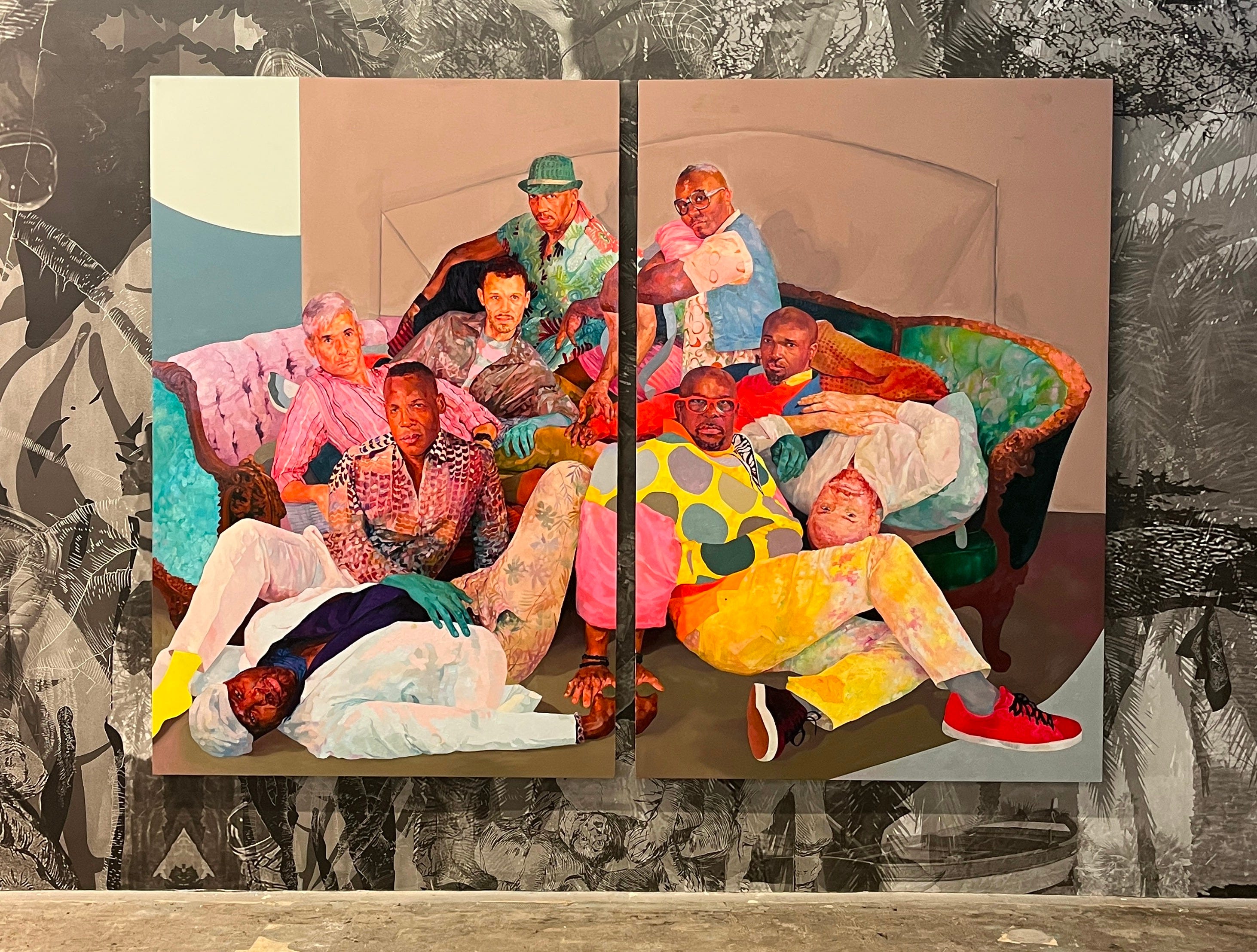
David Antonio Cruz is another Yale-MFA-trained painter who today thinks less about what painting is or what it can be than about what paintings can picture and how to make them. A decade ago the works were weirder, freer. Now they are much more well made but also more righteous, and preening. If these works were presented without any backstory, without any gesture at “community” and “chosen families” and, frankly, the superficial claims for representation that (still?) apparently get taken for a politics, what could one say about them?3 I’d venture it’s all in the “looks,” both the deadpan expressions of Cruz’s sitters and their outfits. All have that vaguely confrontational face that says “I see you looking at me,” but are posed and clothed in ways that are solicitous of attention. Nothing is queer here in a “troubling” way, as in troubling boundaries, or categories, or conventions. This is queerness reified in 2025, a ready-to-wear aesthetic and lifestyle sensibility that, with its wallpaper and chandeliers and patterned upholstery, is nothing more than a decor.

The same might be said about Masako Miki, though there is a sense in which the artist’s many multi-colored and multi-formed, felted “character sculptures” might be doing something else. Where Cruz and Co. talk about queer “joy” like some kind of cope, Miki would seem to produce it — the joy and the queerness — almost as a byproduct of her weird and wooly figures. There is very little to dislike here, and probably even less to think about.4 It’s its own thing, it’s fun, and sometimes that’s enough.
Amanda Ba at Micki Meng
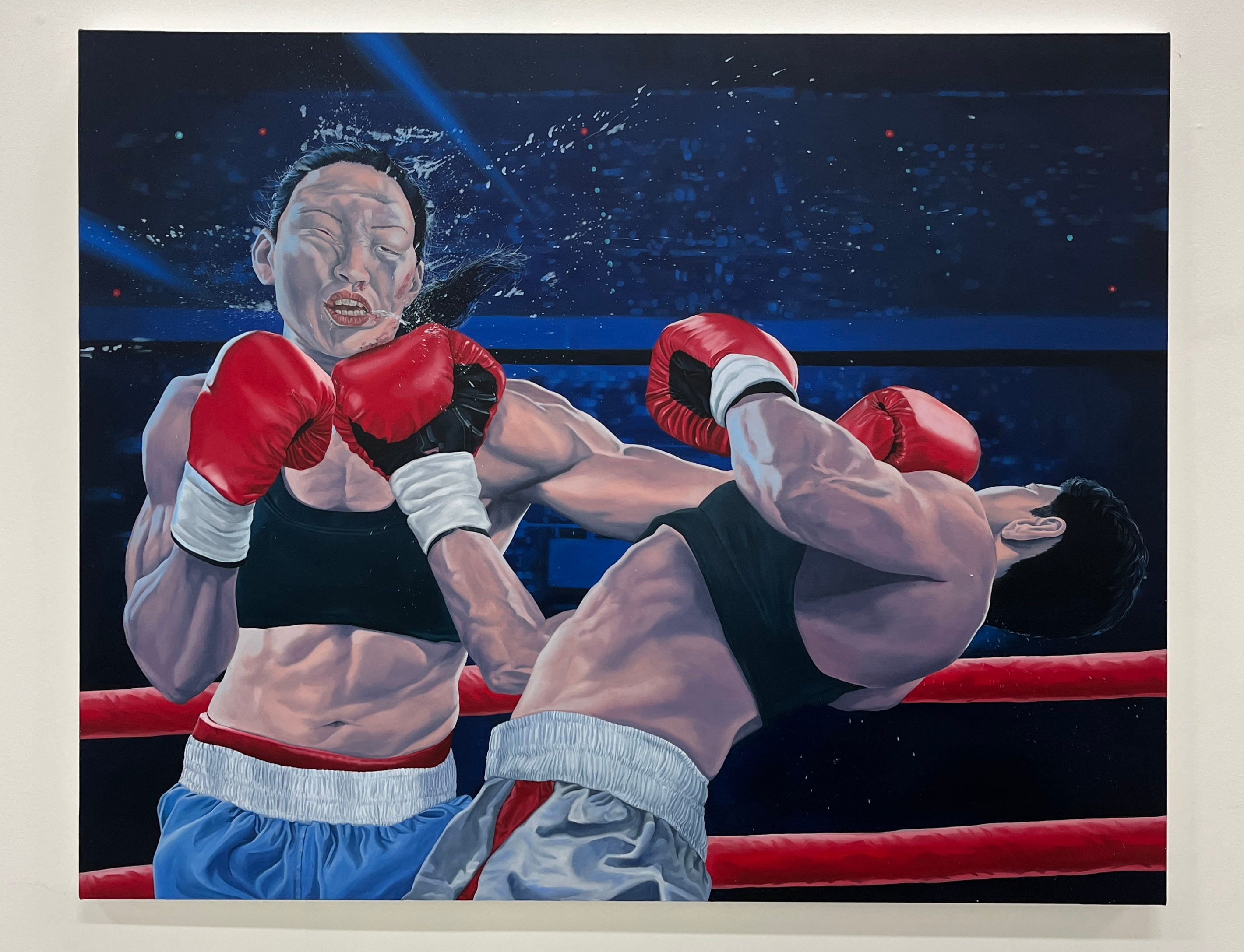
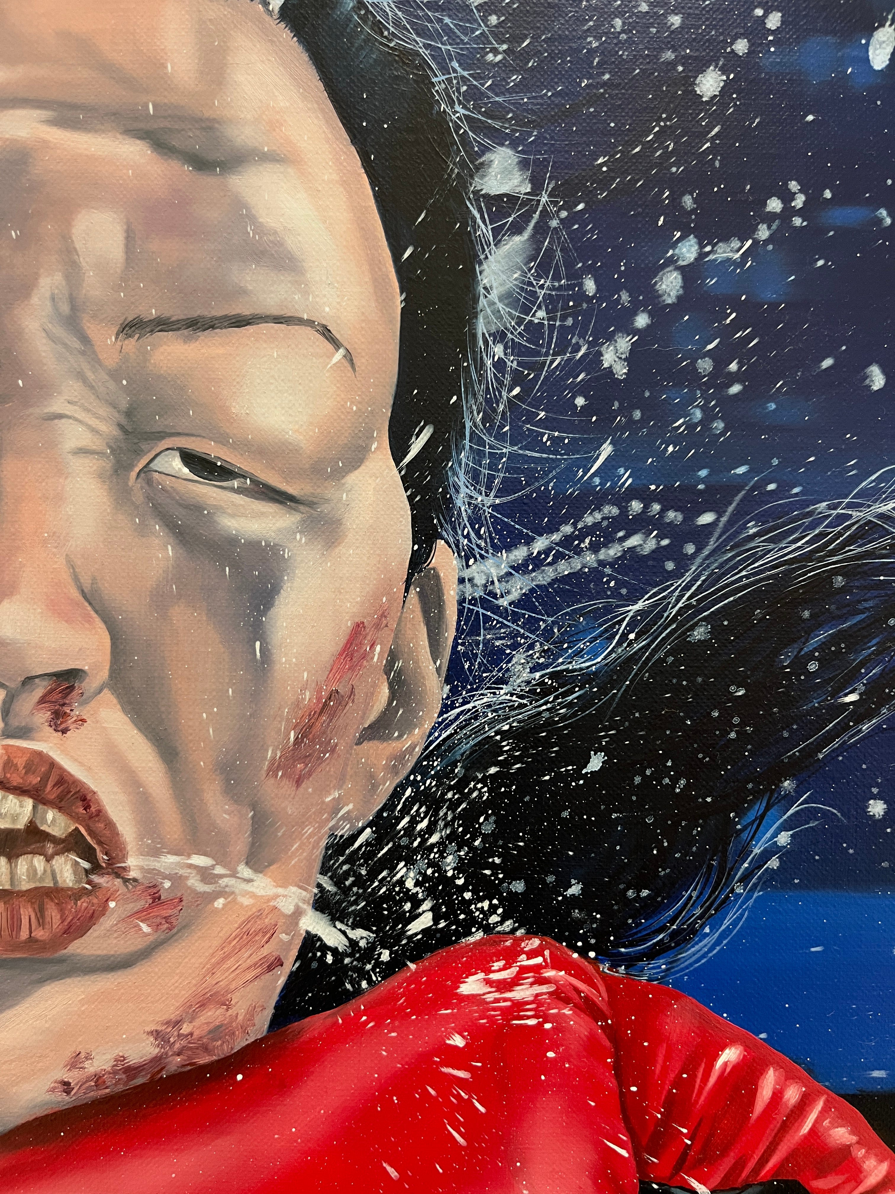
Amanda Ba’s best painting in this show at Micki Meng’s is Knockout II (2025). It contains all of the signature figurative awkwardness that appears in much of Ba’s work, but it also gets at, or encapsulates, a temporality that is relatively new to Ba’s painting. One can see this new concern with time in all of the works in the new series. It is self-evident in Weightlift Cycle (Biopower) (2025), which shows four overlapping “frames” of an olympic lifter performing and completing a clean and jerk. But in Knockout II, the single frame of the image depicts this snap-shot temporality and paints it. The flying saliva and sweat that comes off a boxer’s face when subject to a knock-out punch is the stuff of super-slo-mo YouTube compilations, but it is also where Ba’s painting most reveals itself as such. The flecks and spray, up close, are actually the flecks and spray of paint itself. It’s a moment in the work that both represents a moment and is the effective trace of one.
Images of sports are like that: images of moments taken from, or out of, a flow of action, rather than moments staged as action, which is what one sees in Ba’s earlier work. One could look at Titanomachia (2022) or American Western (2022) as examples here. There is action, but it is action in the service of a scene, rather than action captured in the service of itself.
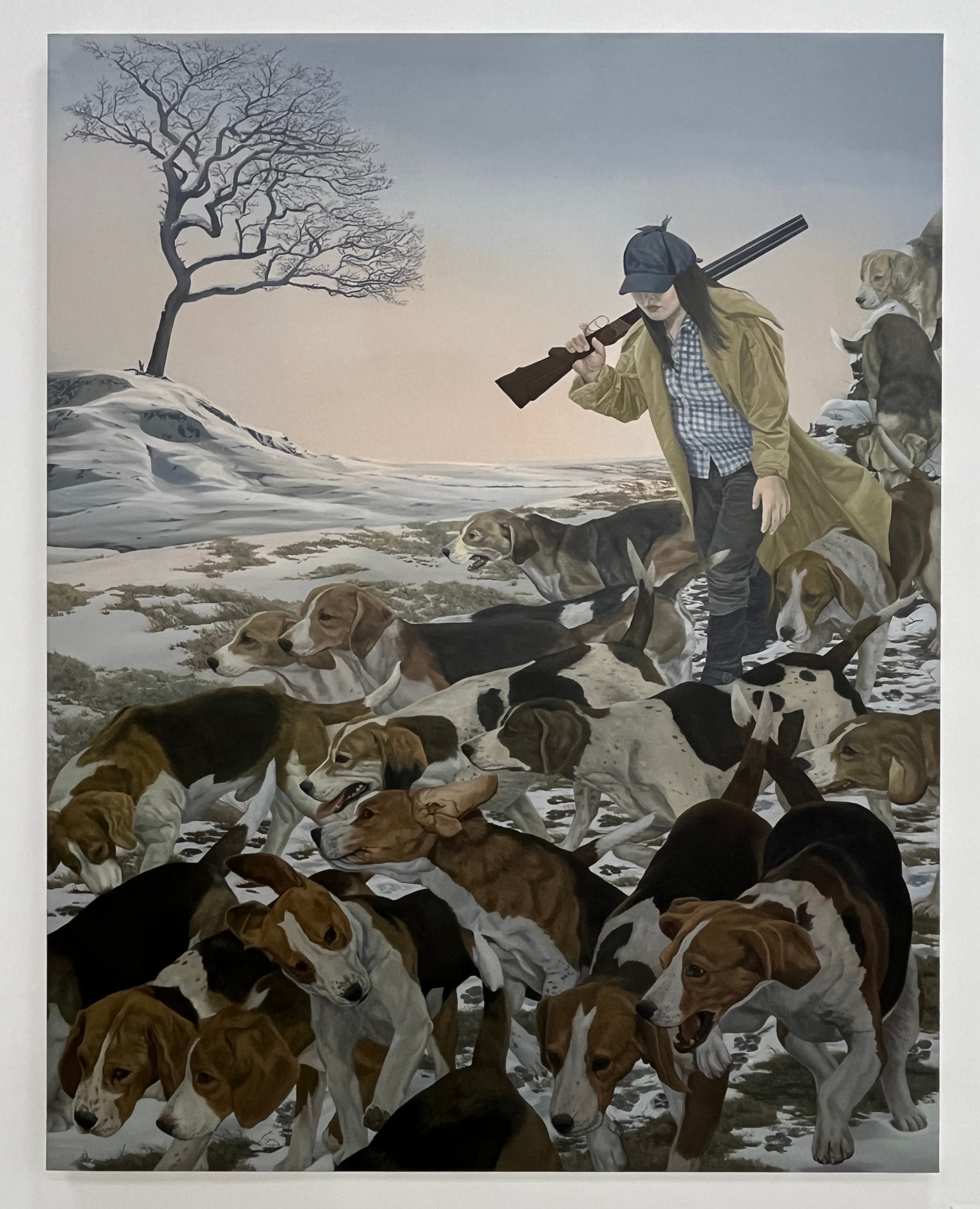
In the new work, even with Hunters (2025), where one might object that the figure of the hunter in that picture isn’t engaged in any significant act other than walking, it’s the dogs, faithfully depicted mid tracking, with heads turning, mouths panting, and ears flapping, through which the time of the picture is registered. The dogs in Ba’s previous paintings, though faithfully rendered, have not been faithfully depicted in their own time. They belong to the scene, and are subordinate to it. While in Hunters they are painted, and are so depicted, as belonging to themselves.
What this means for Ba’s practice, the direction of it, is certainly an interesting question (one that the current writing around Ba’s work fails to address or even to acknowledge, taken as this writing is with wholly received ideas). Whether this indicates a new attention to, or contention with, the image itself in its photographic or digital dimensions (all to the good if so), what it shows is less reliance on overtly symbolic composition — the subject matter as evidently and self-consciously constructed and so meant to mean something — and more curiosity about a kind of totality, one that is capable of being captured in an instant, but one that also unfolds into the kind of allegory (of power, identity, etc.) in which Ba appears to be interested. This new direction fits her style too, of creating canvases with almost no facture, in which paint is totally subsumed by, is subordinate to, the image it is meant to render, except, of course, for those brilliant moments, as with Knockout II, when the two, paint and image, are rendered equal.
I know Dodie Bellamy is beloved fixture in this town, but her text for Jo’s show does the paintings little service. For whatever reason Bellamy feels the need to conjure and so narrate some “figure” in Jo’s paintings. That figure doesn’t exist. To imagine it does would be anathema to understanding what Jo is doing. The best I can say of Bellamy’s text is that it evinces her own compensatory sense of Jo being very much in her own head, and so Bellamy wanted to put some body into it. But that’s as generous as I’m willing to be.
One of the best narrations of what lies on the other side of that upheaval is Cormac McCarthy’s under-appreciated, little-understood, little-discussed last novel Stella Maris (2022).
This is how a recent (not more than a year ago) piece in the Obeserver opened a profile on Cruz: “By playing with and subverting traditional portraiture, Cruz captures the humanity around him in its deepest “truth,” creating a place in art history for queer communities that have long been excluded.” How do the kids put it? “I just can’t….” Is it really too much to ask that we put these pseudo-tropes and anything that even glancingly sounds like them out of their misery? Does anyone believe that we are overburdened by “tradition” today? And “a place in art history for queer communities that have long been excluded”? One presumes it won’t be until Cruz’s work finds its way into the National Portrait Gallery that we will truly see such “queer communities” included in art history, and that day is a long way of…. oh wait, Cruz was presented at the NPG more than a decade ago. Also, Warhol? I almost can’t fault the writer for such stupidities given how pervasive and expected the sensibility is that she channels. Give credit where it’s due, though; those quotation marks around “truth”? That’s in the original. I suspect it was meant merely for emphasis, but the shimmer of irony it can’t help but conjure is more biting than anything I might have hoped to write in a neutered legacy rag doing the PR equivalent of fluff work in North Hollywood.
Little to dislike, except for the surrounds: The only thing that can be said of the ICA SF’s new home in a one-time Bank of America flagship-branch known as “The Cube,” part of the Vornado Realty Trust’s 1.5M square foot 555 California campus in San Francisco’s financial district, is that it’s a great location. The architecture of the space, however, is unforgiving. The ground and basement levels, which the ICA occupies, are dominated by an open auditorium or “social stair” that connects the two floors and anchors the building’s central atrium. Thus one can never really escape the circulatory functions of the space. Even the dimmed and dramatic lighting of Miki’s installation can’t overcome the glowing green exit signs and ambient daylight that filters into the basement level from the atrium. It’s vastly more interesting than a generic white cube, for sure, but everything I’ve seen at the ICA SF thus far takes on the look of those ancillary presentations one confronts in airport terminals that, though well-meaning in their pretense to edification, are there to help you feel better about your boredom (and keep some cultural affairs officers employed). As long as the rent is free, which it is for the next 18 months, all can be forgiven. After that, if rent becomes a real cost, then the space will be real liability.